An Observational Study on Graphical Presentation of Data - A Review
DOI:
https://doi.org/10.47070/ayushdhara.v10iSuppl3.1218Keywords:
Graphical Presentation, figures and charts, data, etcAbstract
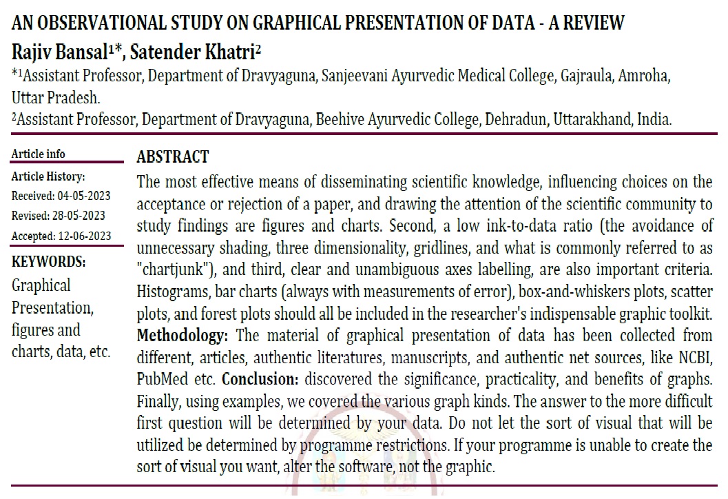
The most effective means of disseminating scientific knowledge, influencing choices on the acceptance or rejection of a paper, and drawing the attention of the scientific community to study findings are figures and charts. Second, a low ink-to-data ratio (the avoidance of unnecessary shading, three dimensionality, gridlines, and what is commonly referred to as "chartjunk"), and third, clear and unambiguous axes labelling, are also important criteria. Histograms, bar charts (always with measurements of error), box-and-whiskers plots, scatter plots, and forest plots should all be included in the researcher's indispensable graphic toolkit. Methodology: The material of graphical presentation of data has been collected from different, articles, authentic literatures, manuscripts, and authentic net sources, like NCBI, PubMed etc. Conclusion: discovered the significance, practicality, and benefits of graphs. Finally, using examples, we covered the various graph kinds. The answer to the more difficult first question will be determined by your data. Do not let the sort of visual that will be utilized be determined by programme restrictions. If your programme is unable to create the sort of visual you want, alter the software, not the graphic.
Downloads

Downloads
Published
Issue
Section
License
Copyright (c) 2023 AYUSHDHARA

This work is licensed under a Creative Commons Attribution-NonCommercial-ShareAlike 4.0 International License.


